
Colour Guidance

TRUSTED COLOUR GUIDANCE FROM THE FOUNDER
As a renovation expert and interior stylist for over a decade, I’ve seen first hand how the right tone can transform a space. When I created the Améli Home palette, I wanted every shade to work effortlessly across all interiors - soft, classic neutrals that bring calm, cohesion, and sustainability together.
Most importantly, the palette I’ve chosen focuses on timeless shades, not trends - these are colours that will feel as relevant years from now as they do today.
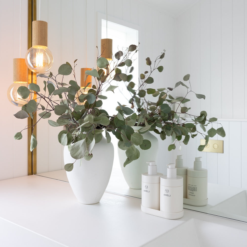
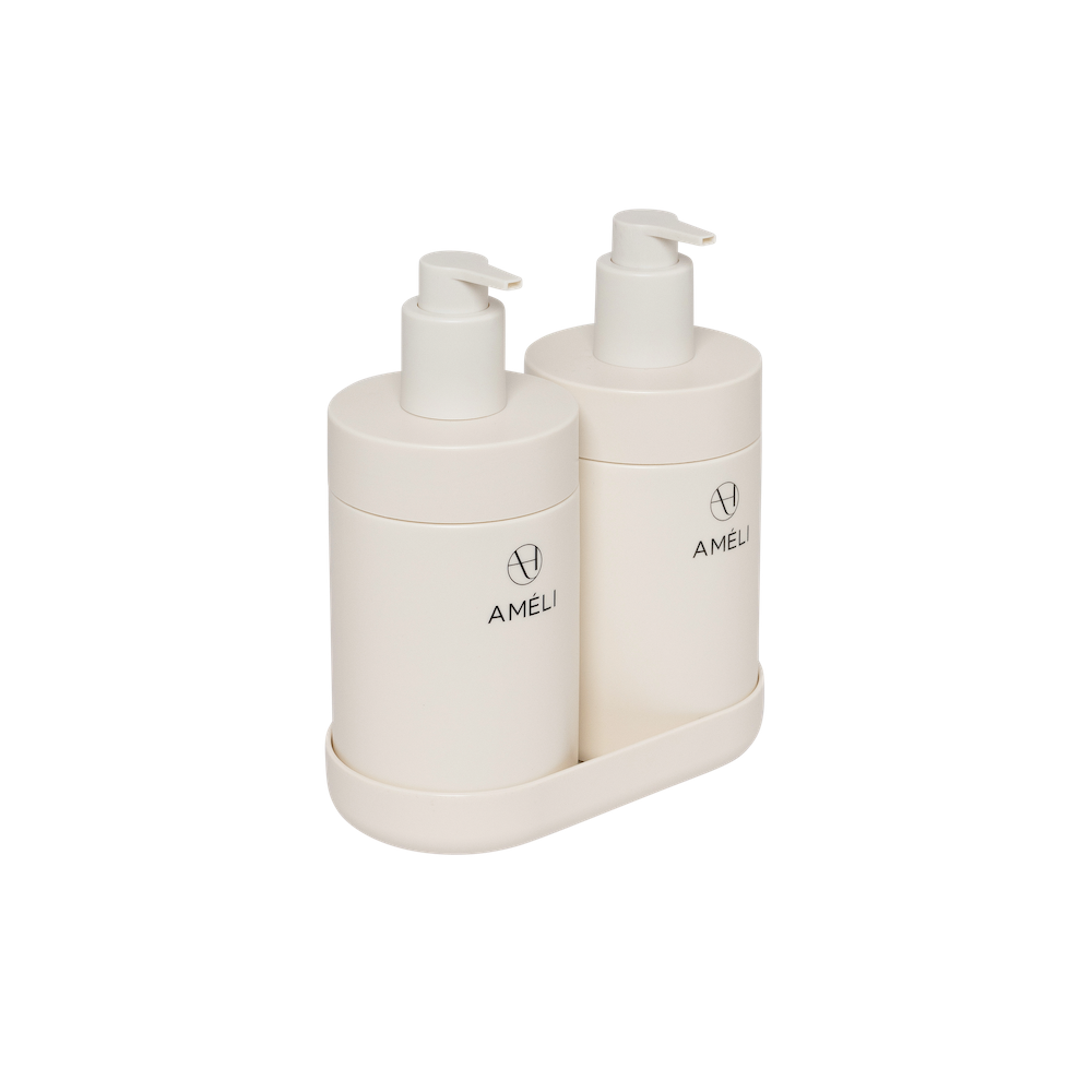
VANILLA
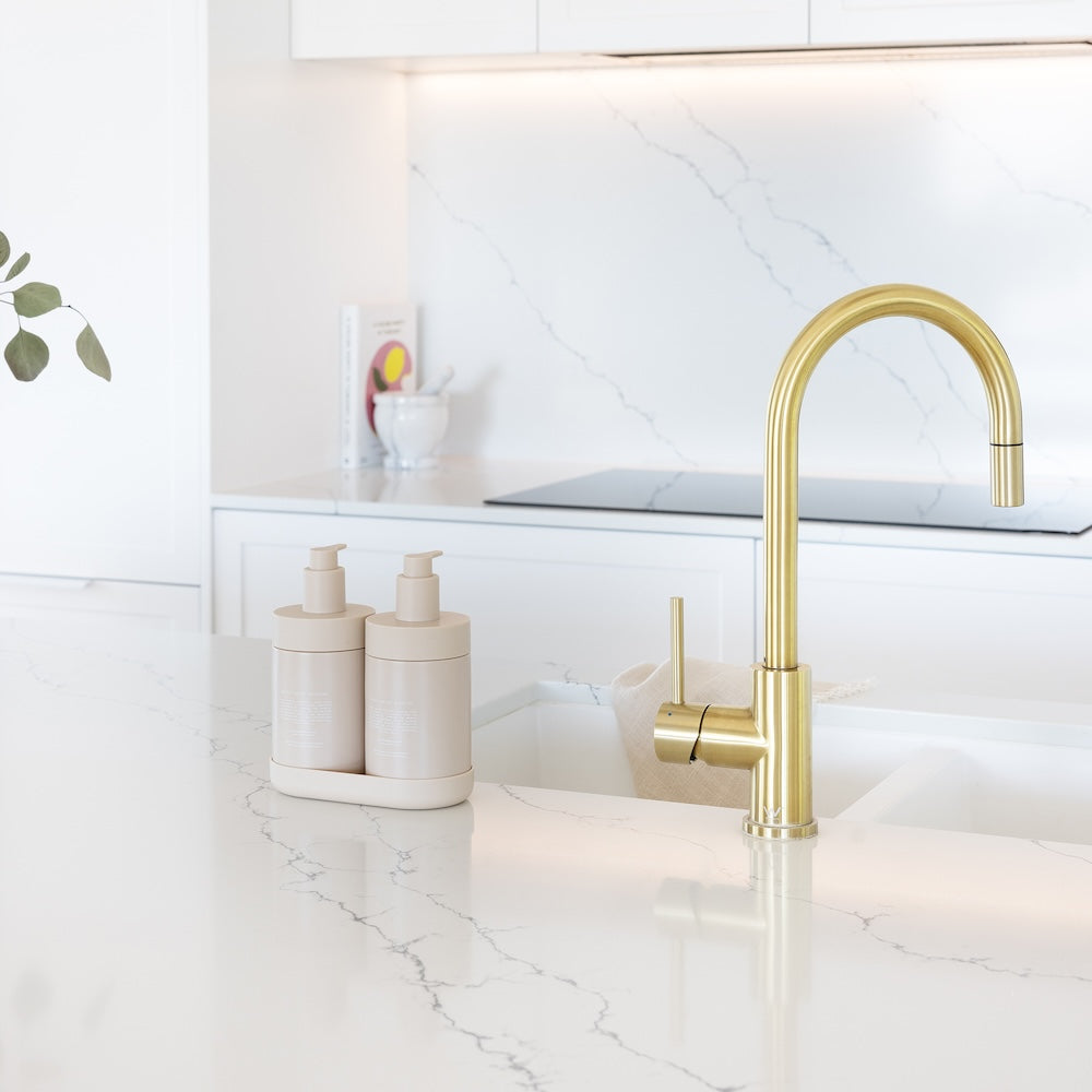
This classic, warm shade of white is timeless and fresh. It is a warm neutral hue that will soften modern or traditional interiors.
While warm at heart, vanilla is a true chameleon, effortlessly pairing with any colour palette. This shade works beautifully with chrome, stainless steel, brushed nickel, and black hardware. It’s the most versatile shade in our collection, bridging the warmth of neutrals with the clarity of black and white for a balanced, timeless look.
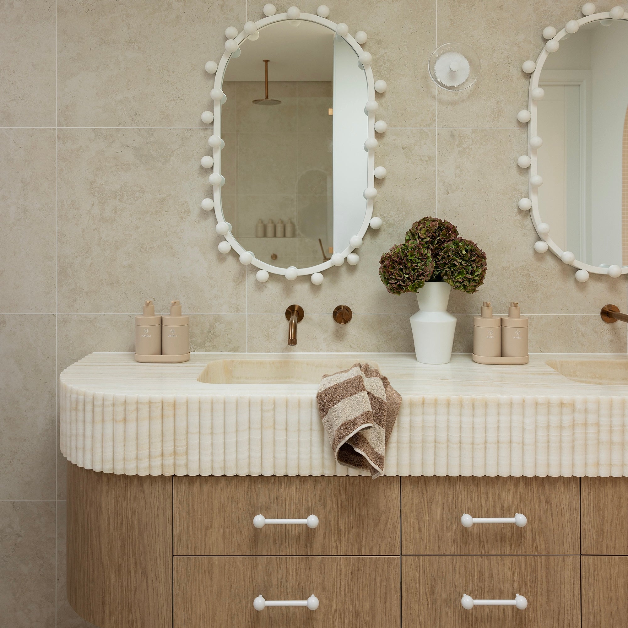
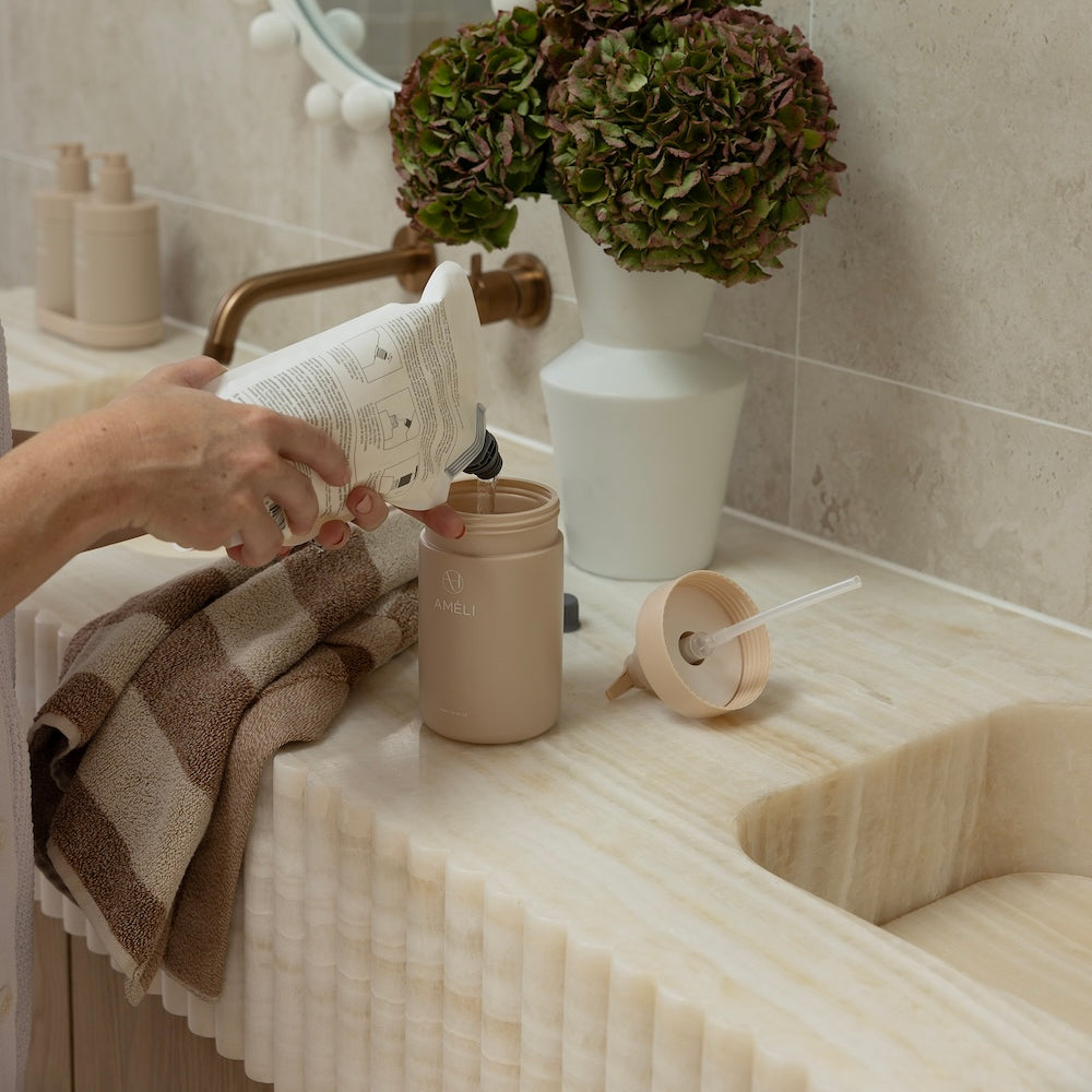
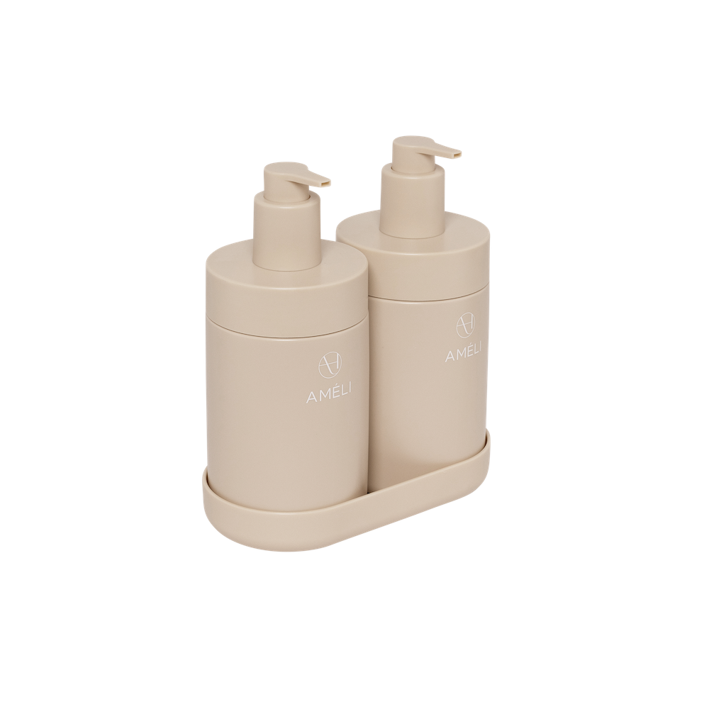
SAND
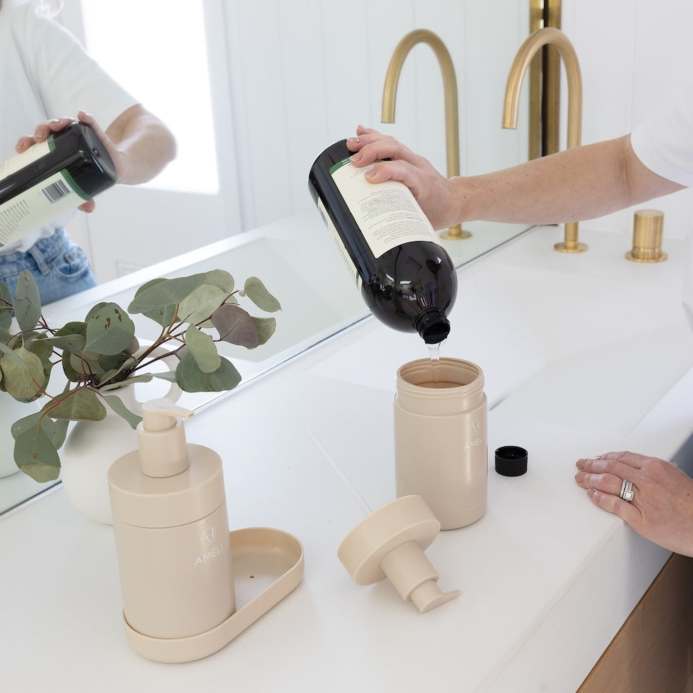
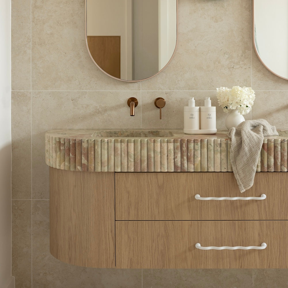
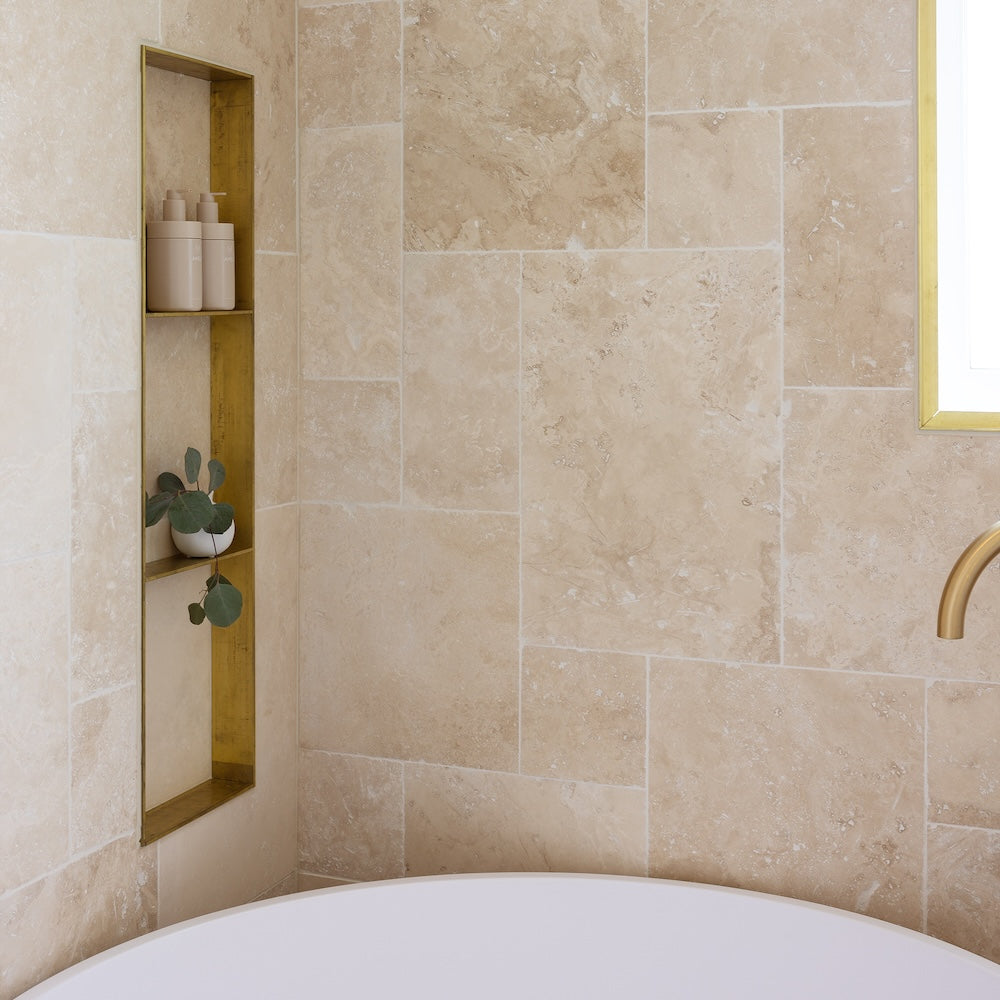
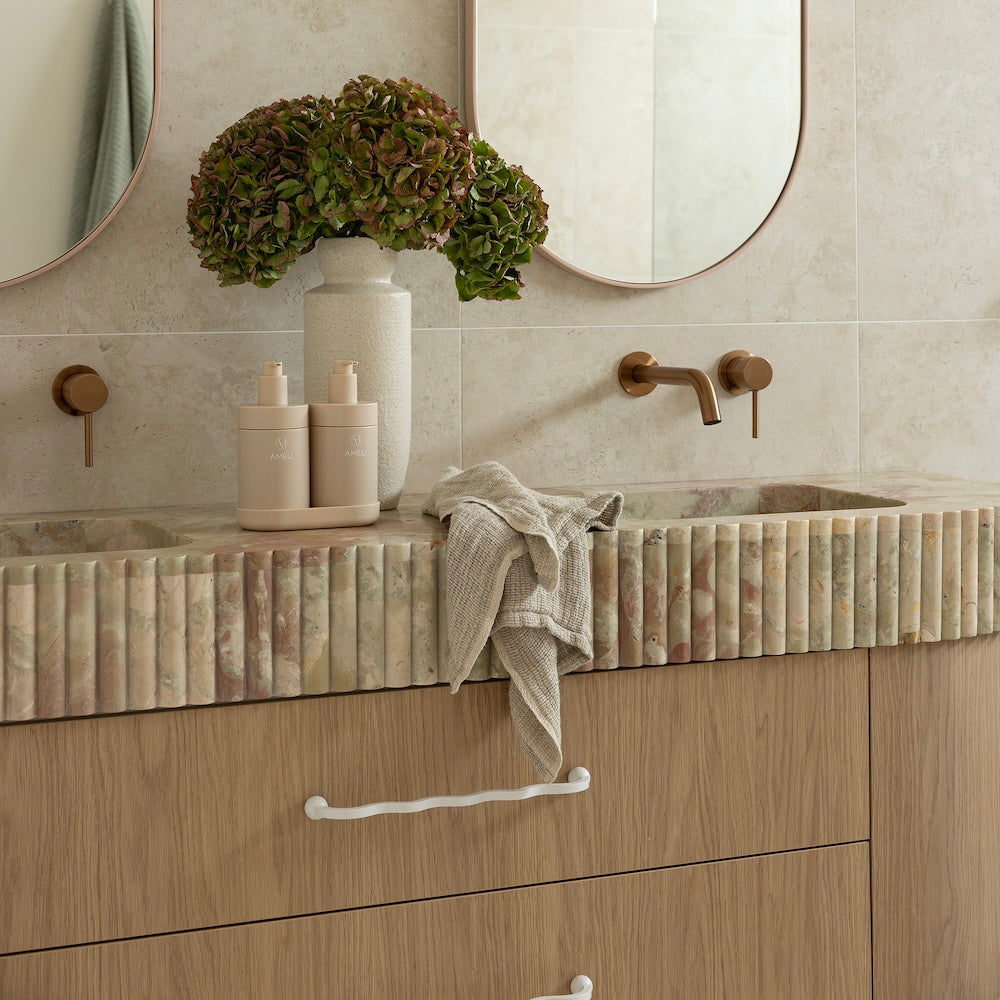
Exuding simplicity, sophistication and refinement, this enduring beige shade has a warm undertone.
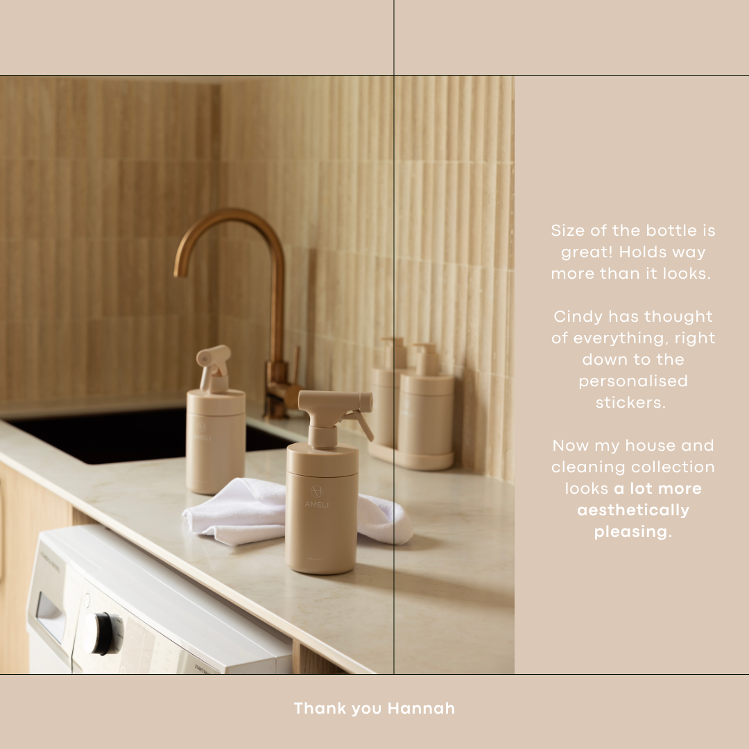
Sand is a neutral shade that works well with all interiors because it can bring warmth and balance to cool spaces, and it can create a soft, natural aesthetic in warm homes. It balances beautifully with materials like stone and oak, bringing softness and flow to your space. Sand pairs harmoniously with whites, charcoals, muted greens, earthy tones and deeply saturated hues, like terracotta, olive, tobacco, rust, or deep navy. Warm metallic accents also work really well, like brass or champagne. In summary, sand is soft enough to blend, warm enough to add depth, and balanced enough to complement both warm and cool finishes.
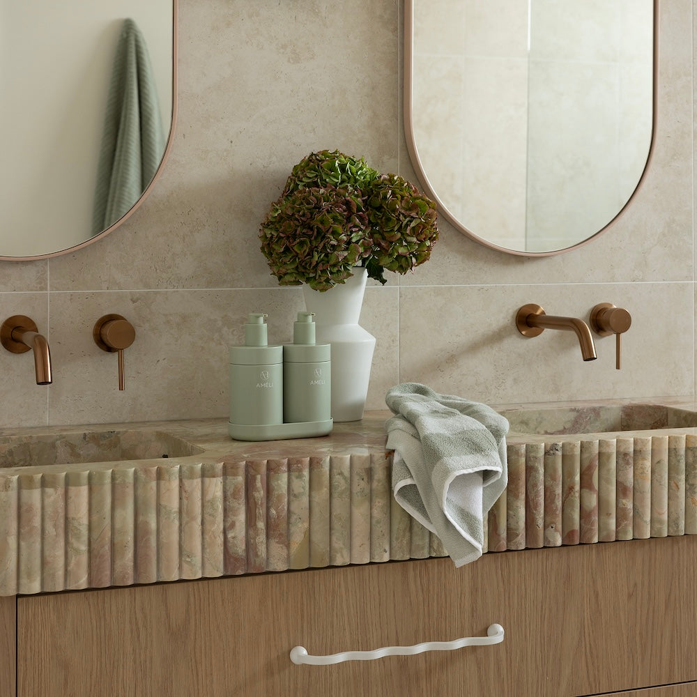
SAGE
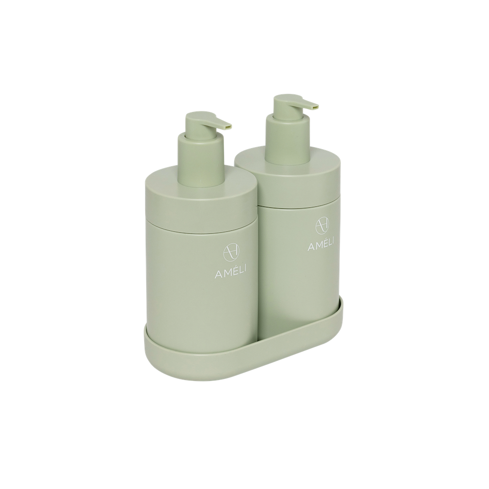
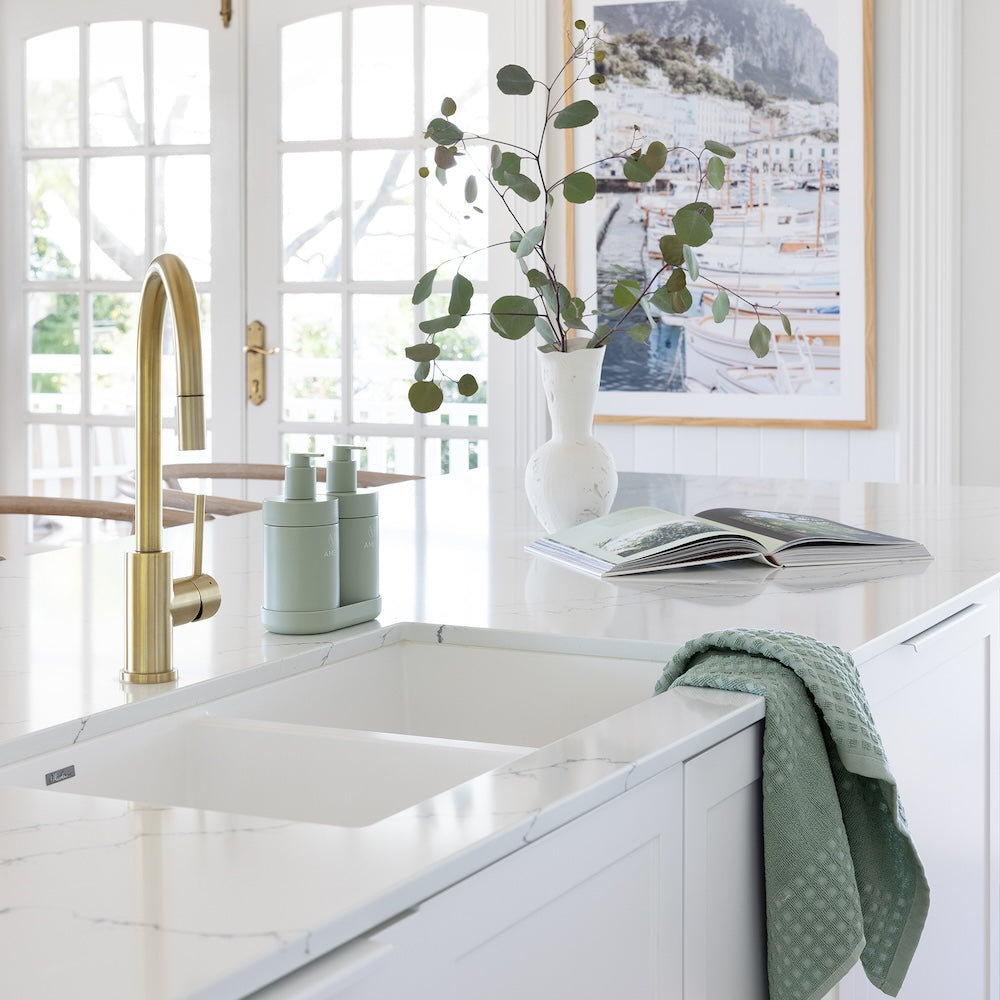
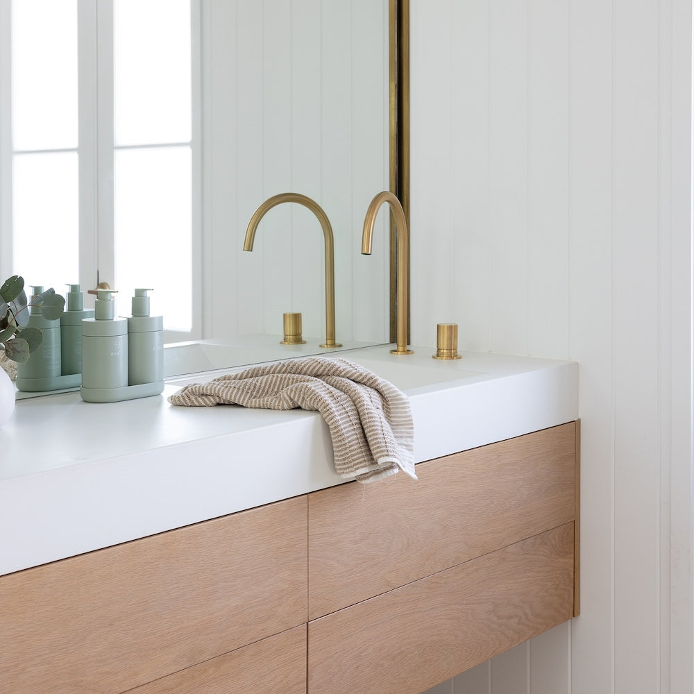
Reminiscent of sage and eucalyptus leaves, this gender neutral hue evokes a sense of calm and connection to nature, with a cool undertone.
Sage feels at home in both cool and warm spaces as it adds gentle warmth and earthiness when matched with cool interiors, but it also works well in warm spaces because it feels calm and grounded without clashing. I reach for sage for homes that feature whites, greys, and soft taupes. It pairs effortlessly with concrete, brushed nickel, brass and muted ceramics. While ideal for calm, pared back spaces, it also thrives in more expressive interiors - sitting gracefully beside blush, mustard, plum, or deep forest tones. A shade that works whether your style is minimal or maximal.